It has been a resounding 12 years since the creation of Terminal Lance, and six since the last redesign of terminallance.com in 2016.
To be honest, and I’m sure this is true for many, the last 6 years has been somewhat of a blur. Between the insane political landscape of our times and the COVID pandemic, I feel like we all collectively lost a few years to the aether of time. I wanted to take a few moments to reminisce about the various stages of Terminal Lance’s flagship site and how it’s changed today.
Terminal Lance 1.0
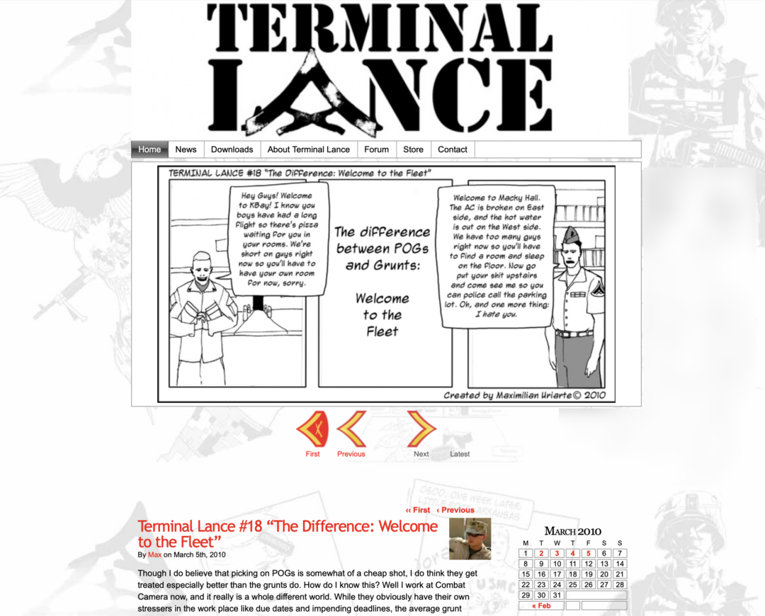
The original site was scrapped together from the fledgling WordPress platform back in 2009, launching officially on January 5th 2010. This was while I was still an active duty Marine in Hawaii, staying up late at night and Googling my way through building a website. With no real idea as to what I was doing, I pieced this together utilizing a WordPress theme called Comicpress, which later became the Webcomic plugin.
Terminal Lance 2.0
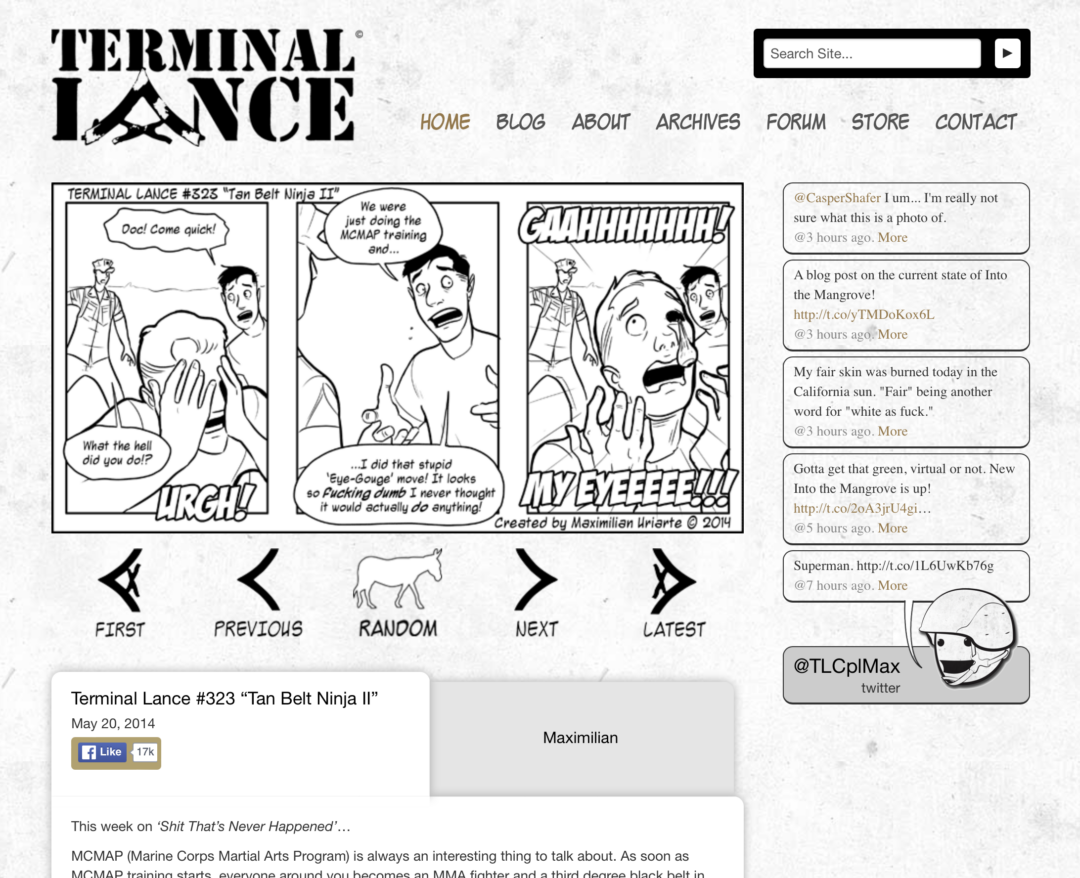
Somewhere around late 2013 we launched a brand new custom website for Terminal Lance 2.0. This was immediately following the massively successful The White Donkey Kickstarter campaign, where we raised over $150,000 to create the (now) bestselling graphic novel. A website redesign was one of our stretch goals for the campaign, and we blew way past it! This is when I started incorporating gold accents (referencing The White Donkey) and what would later become the Muhreen characters into the design.
Terminal Lance 3.0
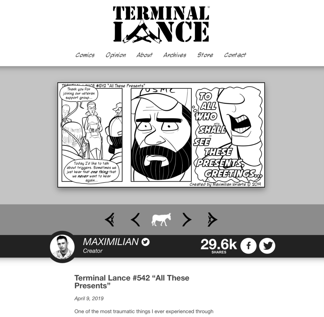
This is where we just were! Terminal Lance 3.0 came about in 2016. This was, in many ways, a throwback to the original 2010 site. I designed the entire thing myself and the simple functionality and presentation fit the 16×9 black and white comic well.
Black and white was the cohesive theme here that tied everything together. The comic strip was thematically black and white for a long time, and the website was designed to embrace this. However, with the change in comic strips from black and white 3-panels to full color squares, re-thinking the site entirely was in order…
Terminal Lance 4.0
Terminal Lance 4.0 is probably the most comprehensive revamp in the site’s history. Throughout its history, Terminal Lance has become much more than just a webcomic. The social media presence surrounding the comic strip has become just as much a part of the story as the comic itself. The focus on Terminal Lance 4.0 is less about the comic and more about the overarching entertainment brand that Terminal Lance actually is.
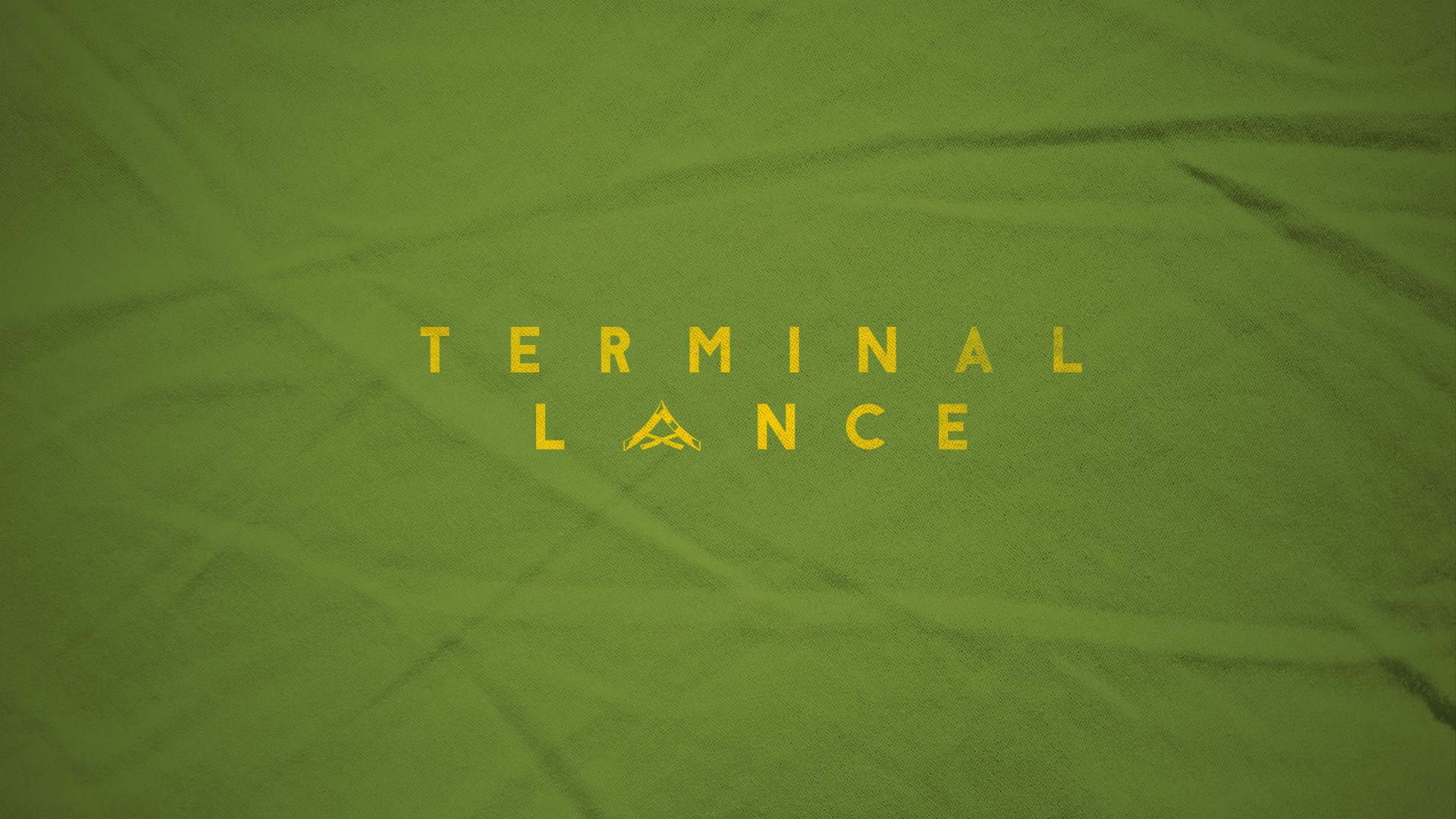
For the first time in 12 years, we even have a new logo. The olive drab skivvy green with yellow accents harks to the core of what Terminal Lance has always been: a place for the Marines. The enlisted.
…The Lance Corporals.
My role as the center of attention has changed over the years. This has been good and bad in some ways. On one hand, it’s less pressure on me to be in front of everyone personally. On the other, I feel like I don’t have the same connection that I used to with the audience. Knowing this, my goal with the new Terminal Lance is to embrace and empower new content and new voices, while keeping the catalog of comics you’ve loved since 2010 alive and well.
Leave a Reply